Color Picker - WPF
WPF version of ColorPicker
Section titled “WPF version of ColorPicker”
Example Usage
Section titled “Example Usage”See ColorPickerDemo for an example project.
Basic usage:
Install the NuGet package, insert a reference to the ColorPicker namespace
<Window ...xmlns:colorpicker="clr-namespace:ColorPicker;assembly=ColorPicker"...>Add the controls
<colorpicker:StandardColorPicker x:Name="main" Width="200" Height="380"/><colorpicker:PortableColorPicker ColorState="{Binding ElementName=main, Path=ColorState, Mode=TwoWay}" Width="40" Height="40"/>Note: in some configurations such as using the package in .NET Framework 4.7 the XAML designer tends to break and not show the control.
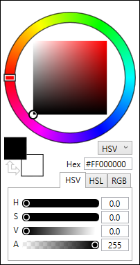
Styling
Section titled “Styling”Out of the box, the color picker uses the default WPF look:
You may use the included PixiEditor’s dark theme by loading a resource dictionary in XAML:
<Window.Resources> <ResourceDictionary> <ResourceDictionary.MergedDictionaries> <ResourceDictionary Source="pack://application:,,,/ColorPicker;component/Styles/DefaultColorPickerStyle.xaml" /> </ResourceDictionary.MergedDictionaries> </ResourceDictionary></Window.Resources>and referencing DefaultColorPickerStyle in the style attribute of a control:
<colorpicker:StandardColorPicker Style="{StaticResource DefaultColorPickerStyle}" />As an alternative, the same can be achieved programmatically:
var resourceDictionary = new ResourceDictionary();resourceDictionary.Source = new System.Uri(    "pack://application:,,,/ColorPicker;component/Styles/DefaultColorPickerStyle.xaml",    System.UriKind.RelativeOrAbsolute);
StandardColorPicker picker = new StandardColorPicker(){    Style = (Style)resourceDictionary["DefaultColorPickerStyle"]};
You may define your own styles, see DefaultColorPickerStyle for reference.
All of our content is carefully written by hand, no AI was involved during the process.