

The UI Walkthrough
Welcome to PixiEditor!
If you haven’t yet, you can download PixiEditor here.
On this page, you’ll find all the information about the app’s UI.
The Startup Window
Section titled “The Startup Window”Once you open the app, an extra window will open up called Hello there!. That is the startup window. You can also open it manually by going to View → Open startup window in the menu bar.
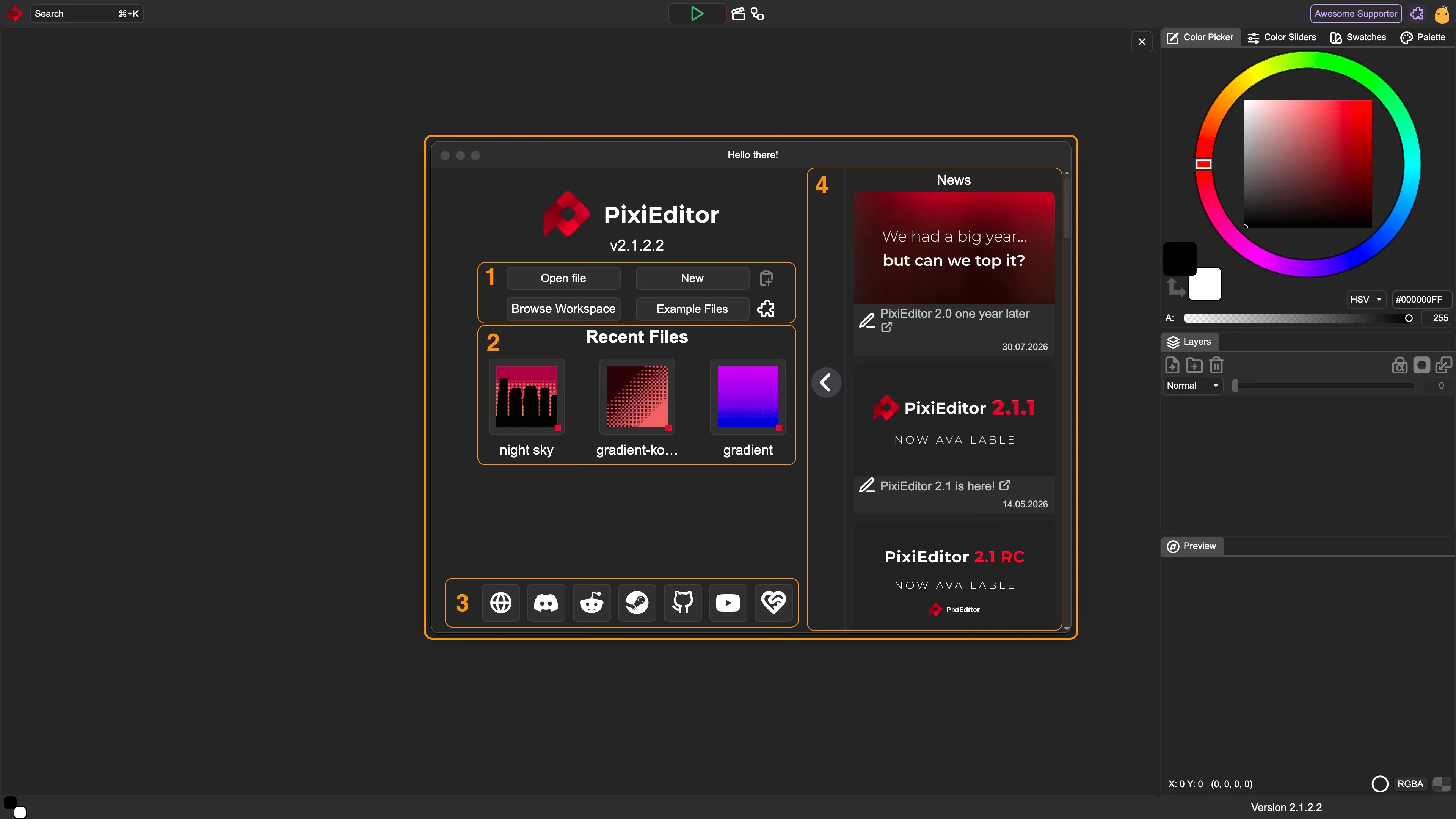
In the screenshot, there are 4 main parts of that window highlighted in orange:
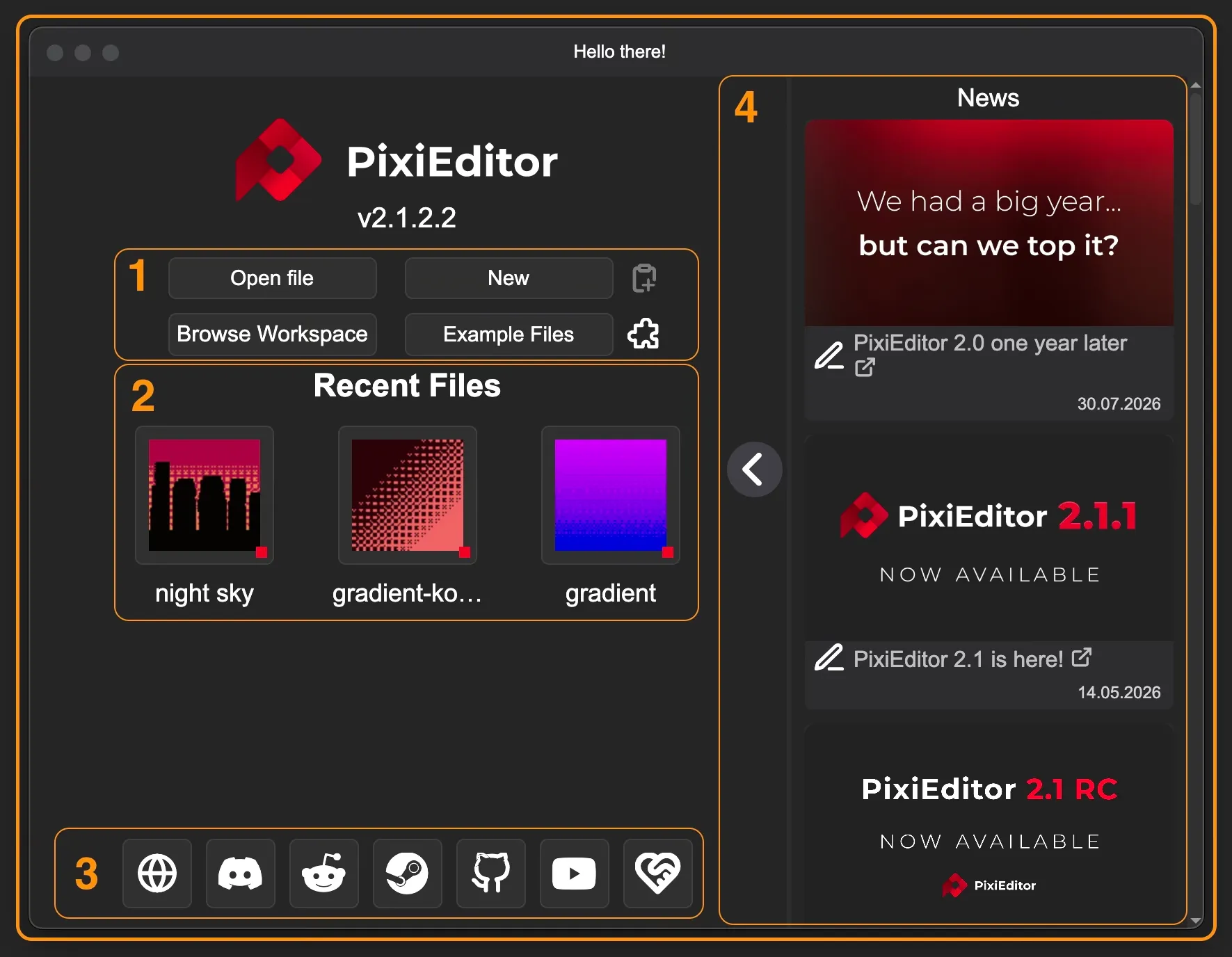
1. Button Group
Section titled “1. Button Group”Open FileOpens file explorer. It lets you choose pixi files, but also all other file types supported by PixiEditor such as jpg, png, svg, etc.NewOpens the Create New Image Window.Browse WorkspacesOpens the Workspaces Browser. Visible only with Workspaces extension installed, which is available in the Extension LibraryExplore FilesOpens the Example Files made by PixiEditor Team and Contributors.- - Creates new file from clipboard
- - Opens extensions library
2. Recent Files
Section titled “2. Recent Files”Under Recent Files, you can see your most recent files opened. To see it as a list with a full path, go to File → Recent in the menu bar.
3. Social Icons
Section titled “3. Social Icons”At the bottom of the page, you’ll find key PixiEditor links. Hover over any link to preview its destination.
4. News Feed
Section titled “4. News Feed”A panel with PixiEditor-related news. It can be hidden by clicking a button with an arrow or permanently disabled in the settings.
Create New Image
Section titled “Create New Image”There are 3 main ways to create a new empty file:
- Click the
Newbutton in the startup window - Use a shortcut
Ctrl + Non Windows or⌘ + Non Mac - Use
File → Newin the menu bar
Each of the above will open the Create New Image Window:
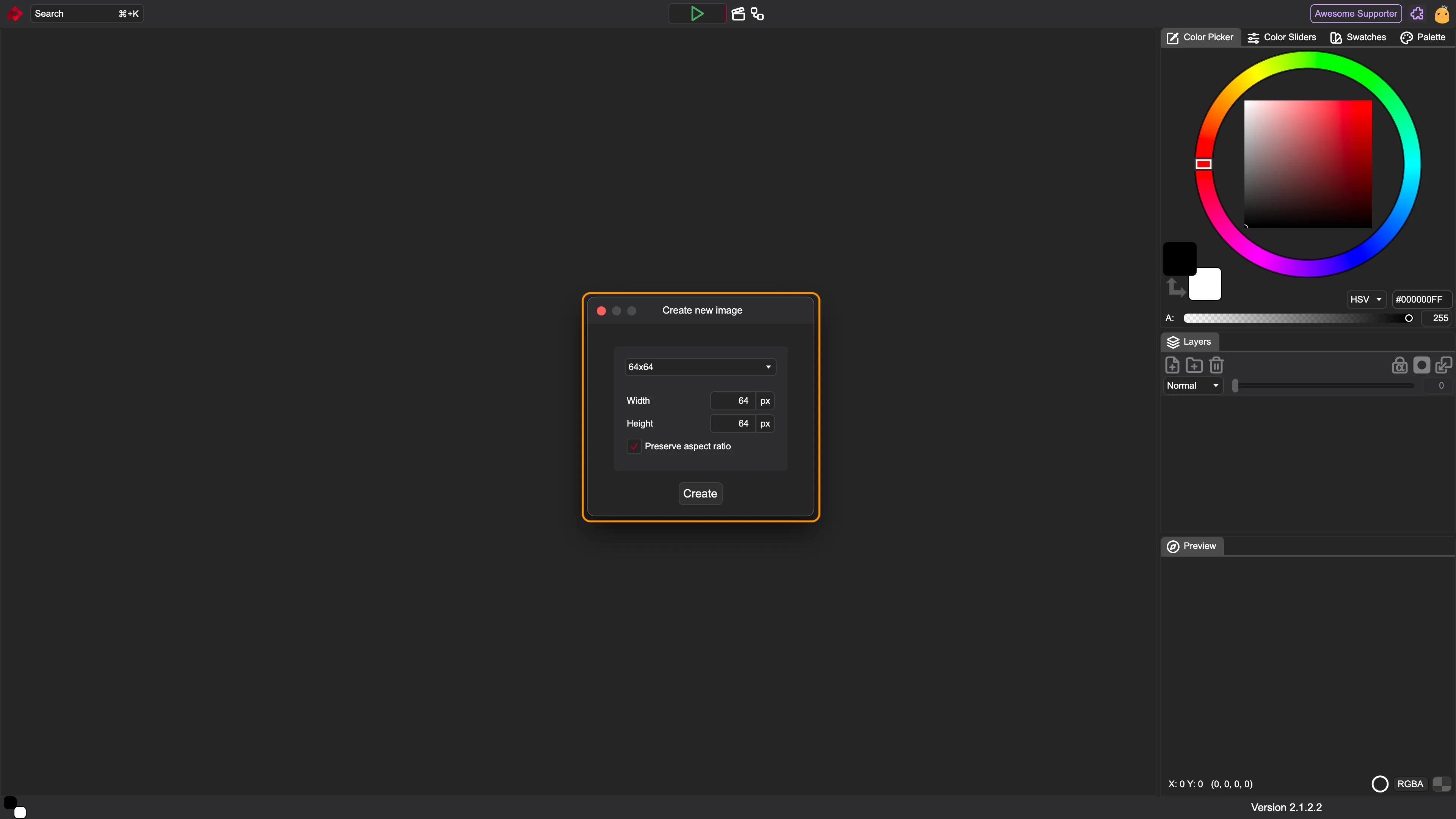
From top to bottom, the options in this window are:
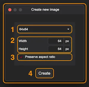
1. Presets Picker
Section titled “1. Presets Picker”A dropdown menu containing presets of the 9 most popular image dimensions. Selecting a preset prefills the width and height inputs.
2. Width + Height
Section titled “2. Width + Height”Use these fields to set your desired dimensions. You can type values directly using your keyboard or click and drag to the sides to adjust the number.
The fields support basic math operators (+, -, *, /). For example, typing 1920/2 and clicking outside the field automatically calculates the result.
Note: PixiEditor currently supports pixels only.
3. Preserve Aspect Ratio
Section titled “3. Preserve Aspect Ratio”Checking this box locks the proportional relationship between width and height.
Once you choose all options, click the Create button at the bottom or hit Enter.
Toolsets
Section titled “Toolsets”Located to the left of the canvas (when a file is open), toolsets group tools by workflow:
- Pixel Art: Hard-edged tools with no anti-aliasing
- Painting: Soft-edged tools with anti-aliasing enabled
- Vector: Scalable, path-based tools that keep shapes sharp at any resolution
- Adjustments: Tools for color, exposure, and image corrections
Toolsets are fully customizable! See the Creating custom tools with Brush Engine page for details.
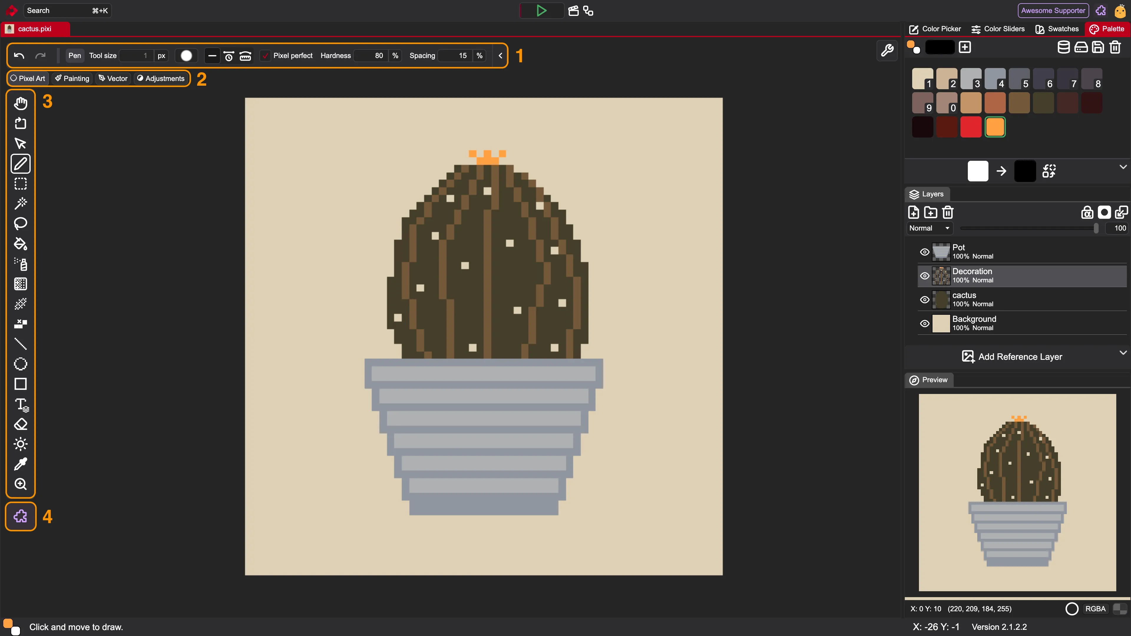
1. Tool Context Bar
Section titled “1. Tool Context Bar”On the left side of the context bar, there are always visible undo and redo arrows. They change the last action made in the app no matter what tool is selected. You can also use shortcuts for that: Ctrl + Z / ⌘ + Z for undo, and Ctrl + Y / ⌘ + Shift + Z for redo.
The second part of this bar is collapsible. You can hide it by using the arrow at the end of the bar. This part shows the tool’s name and its specific settings. You can notice how it changes while selecting different tools.
2. Toolset Picker
Section titled “2. Toolset Picker”To switch your active toolset, hover over the toolset pill to reveal the available options. Alternatively, you can cycle through them using keyboard shortcuts: Shift + E to move forward and Shift + Q to move backward.
3. Tools
Section titled “3. Tools”Below the toolset name, there is a group of icons, each representing a different tool. To select a tool, click on its icon. The active tool is marked with a white outline.
4. Extension Library
Section titled “4. Extension Library”Opens the Extension Library, where you can browse and download extra tools, brushes, and workspaces.
Preview Tab
Section titled “Preview Tab”In the bottom right corner, you can see the preview tab.
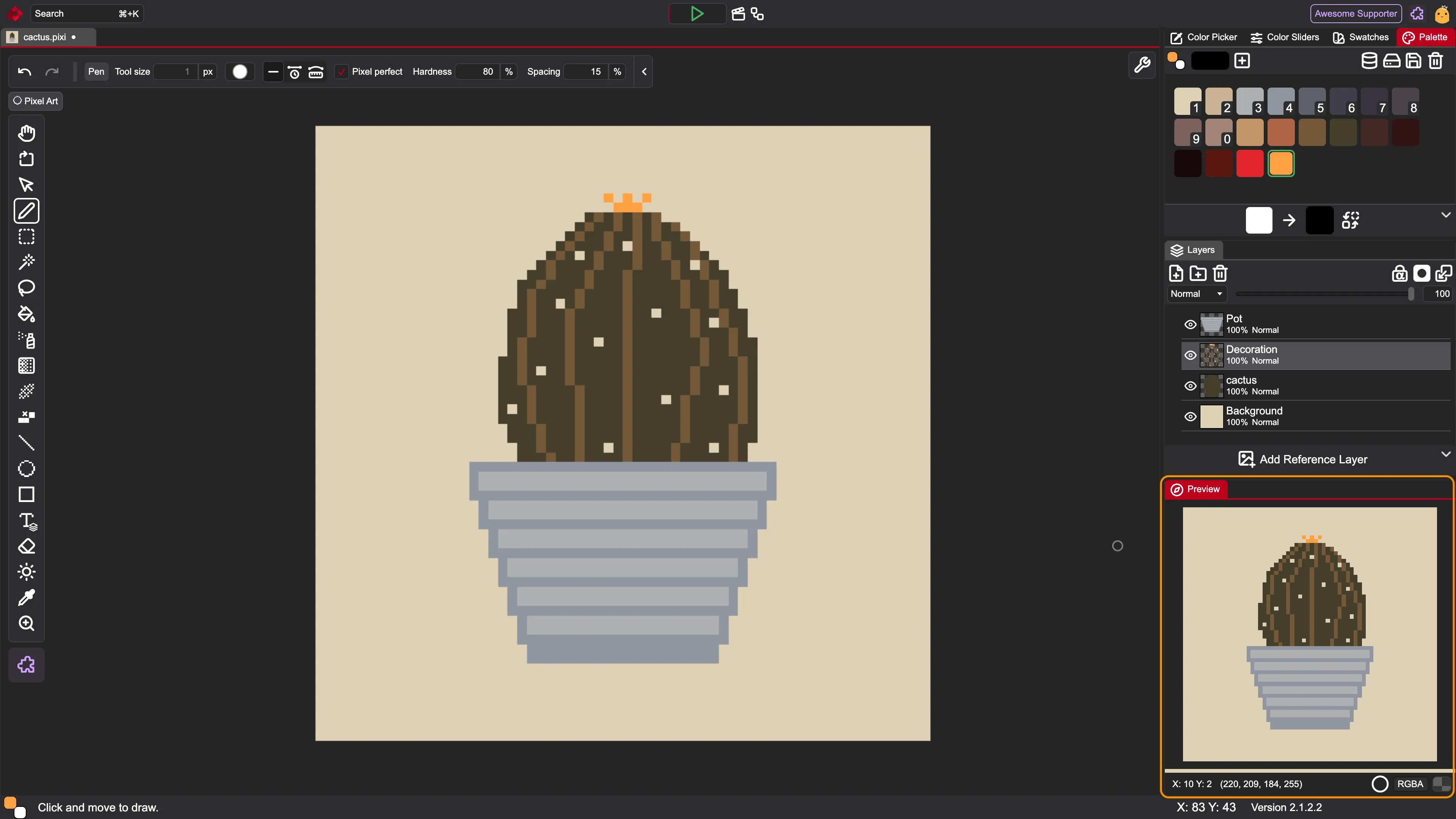
Other than the preview itself, there are some information and toggle buttons in the bottom.
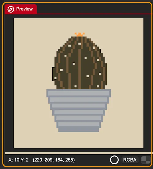
While using your pointer on the preview, you can see the pointer position (X and Y) and the color your pointer is pointing to. By default, the color is in RGBA. You can change it to HEX by using the toggle on the right with the color format name.
The white circle lets you choose between high resolution (vectors render smoothly without pixelation) and low resolution (vectors render to the document’s actual size) of preview.
In the right corner, there is an option to change the background of the preview. By clicking the rectangle, you change to: no color, solid white, solid black, checker pattern. Of course, this feature makes sense only if you don’t have a fully filled layer on your canvas.
Layer Panel
Section titled “Layer Panel”Layers are the heart of your files. By default, the layer panel is placed in the middle of the right side of the app.
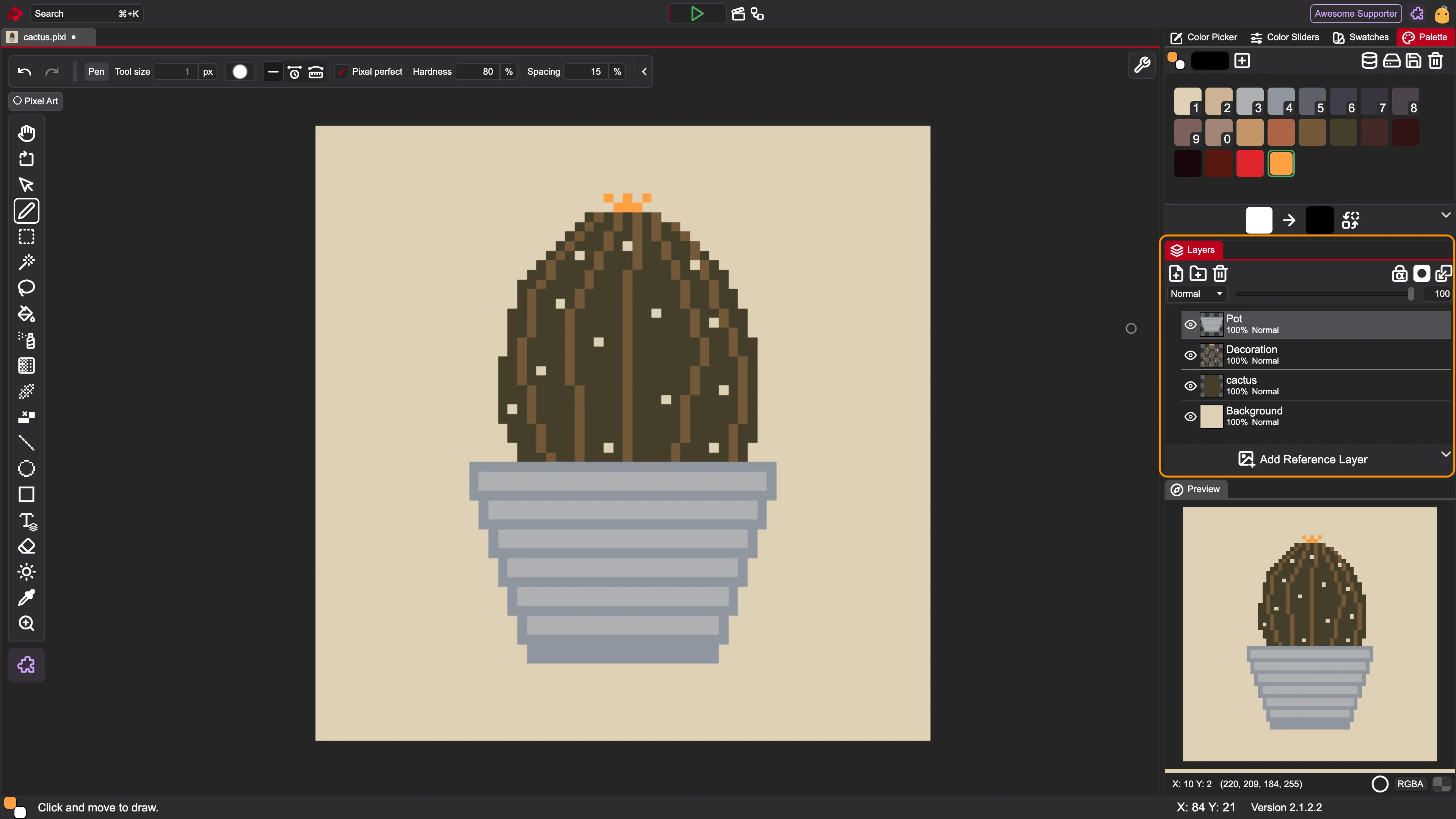
It contains a few sections highlighted below:
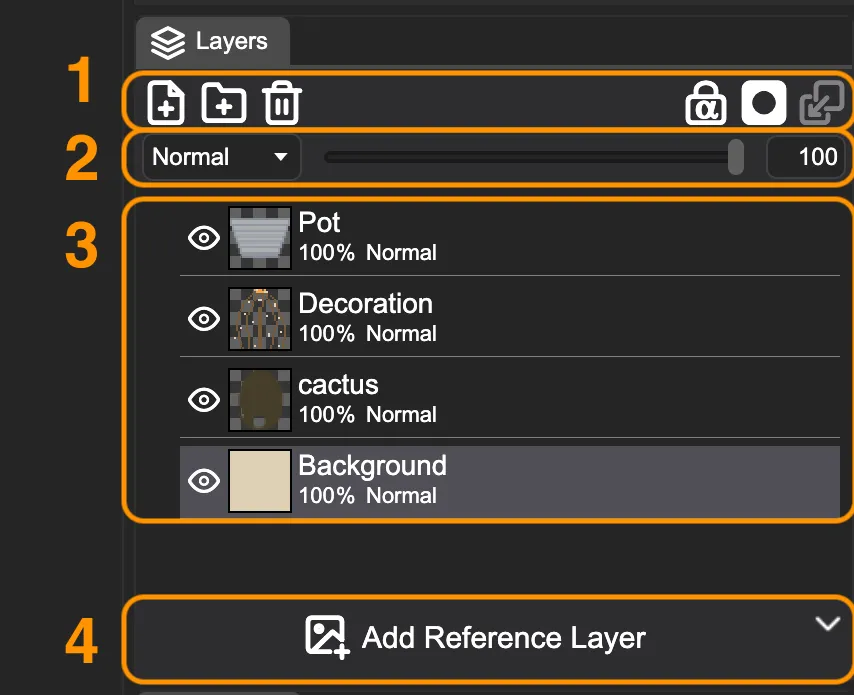
1. Button Group
Section titled “1. Button Group”- - Creates new layer
- - Creates new folder
- - Deletes all selected layers and folders (you can redo this action)
- - Locks transparency of the select layer. Enabling this option will prevent tools from editing transparent pixels.
- - Creates a mask for the selected layer
- - Combines selected layer/group with the layer/group below into a single, unified layer, flattening pixels together and reducing your total layer count.
2. Layer Options
Section titled “2. Layer Options”For each layer, you can change the blend mode by clicking the dropdown menu (set to Normal by default). Next to it is an opacity slider, which you can use to adjust how transparent the layer is. You can either drag the slider or click its numerical input field to type in an exact opacity percentage.
3. Layers
Section titled “3. Layers”Each layer has an eye icon / to toggle its visibility in the composition. Next to it is a thumbnail preview of the layer content, followed by its name, blend mode, and opacity settings.
To rename a layer, double-click its name to enter text-editing mode and type your new title.
4. Add Reference Layer
Section titled “4. Add Reference Layer”Sometimes you may want to use an external image as a visual guide while working. To add one, click the Add Reference Layer button and select a supported raster image file (such as PNG or JPG) from your computer.
Unlike standard layers used for drawing, a reference layer is strictly for visual preview and guidance. It is excluded from the actual layer tree, meaning it can’t be painted on or edited directly. Because it is purely for preview, it won’t interfere with your artwork and maintains high resolution even on small canvases.
Once you select an image, you’ll see it on the canvas, and some new elements will appear on the UI:

- / - Hides / Shows the reference layer
- / - Changes the reference layer position to above/under other layers
- Preview of the reference layer
- - Enters a transformation mode for the reference layer (scaling and moving the layer)
- - Resets transformations made to the reference layer
- - Deletes the current reference layer.
Color Tabs
Section titled “Color Tabs”This panel by default is made out of 4 tabs and lets you work with colors.
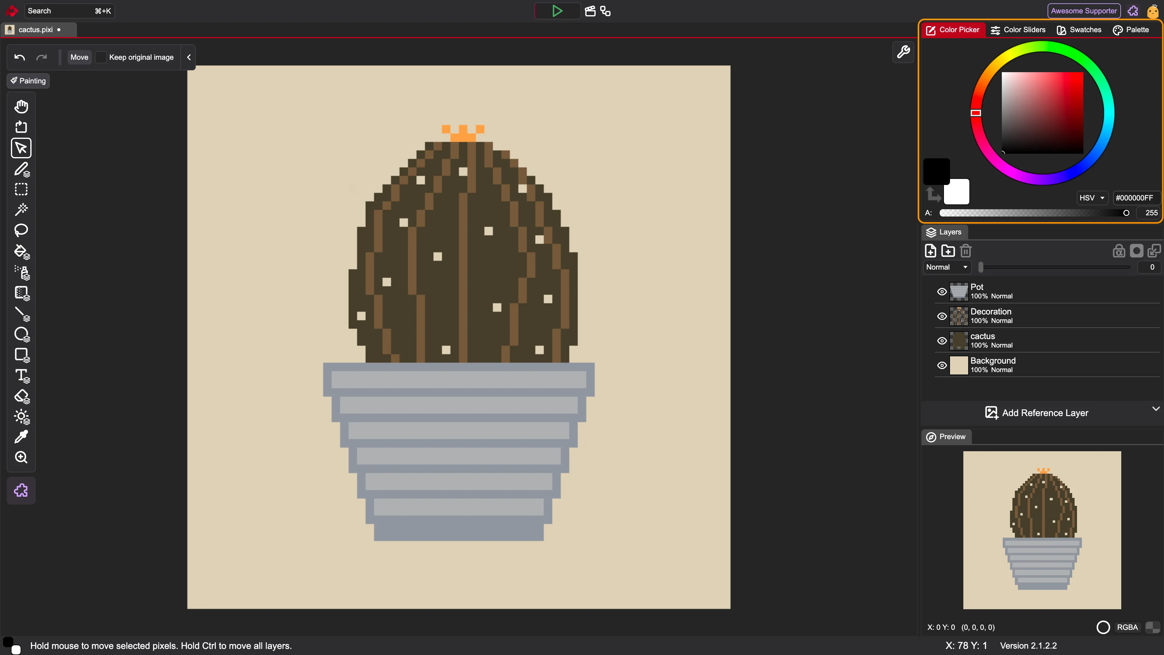
We’ll describe each separately.
Color Picker
Section titled “Color Picker”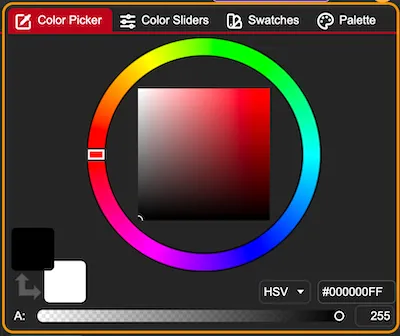
The main part of this tab is an HSV/HSL Color Picker, which consists of a circular hue slider and HV/HL square.
In the bottom-left corner, there are 2 squares with an arrow. The top square is the primary color, and the one below is the secondary color. Clicking on the arrow swaps the two colors (default keyboard shortcut: X).
On the bottom, there is a wide slider which controls the alpha. You can also use an input on the right to change its value.
The last two elements are the HSV/HSL dropdown and a color value written in HEX.
The dropdown allows you to switch between HSV and HSL color space representations. Next to it, the color value is displayed in the #RRGGBBAA HEX format, where the pairs of hexadecimal characters represent Red (RR), Green (GG), Blue (BB), and Alpha/Transparency (AA).
Color Slider
Section titled “Color Slider”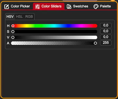
With these sliders, you are changing the primary color. It is a set of HSV/HSL/RGB + Alpha sliders. They additionally have inputs for entering precise values.
Color Swatches
Section titled “Color Swatches”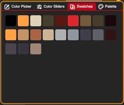
Using a canvas-editing tool (such as the pen, shapes, or bucket fill) automatically adds your active primary color to the swatches list. For example, if you apply a semi-transparent red using the bucket fill tool, that exact semi-transparent color is added to your swatches for quick re-selection.
Using non-editing tools like the color picker will not add a swatch.
Color Palette
Section titled “Color Palette”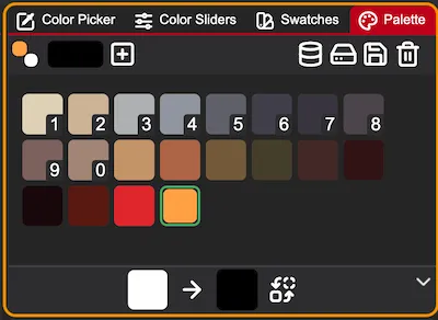
This tab lets you use and edit color palettes in PixiEditor. Color palettes are quite advanced, so all features not visible at first glance will be covered in another material.
Most actions can be found at the top bar:
- The two squares present current primary and secondary colors just like in the color picker (you can click
Xon the keyboard to swap them) - The longer rectangle is for adding new colors to the color palette. It doesn’t change the primary color. Clicking on it opens a small color picker.
- - Adds selected color to the palette
- - Opens the Palette Browser
- - Opens file manager to import a new palette from your drive.
- - Saves the palette to your drive
- - Deletes the current palette
In the middle, you can see all colors of a palette. The first 10 colors have small numbers - that is the shortcut for choosing a color. Just click a corresponding number on your keyboard to set it as the primary color. You can drag the color rectangles to change order.
At the bottom of the interface, you’ll find a panel dedicated to replacing palette colors. This is a global operation: changing a color here updates not only your palette, but also automatically repaints every pixel on your canvas that currently uses that color.
To replace a color:
- Drag the color you want to change from your palette into the left rectangle.
- Click the right rectangle to choose your new replacement color.
- Click the swap icon to apply the change across your palette and canvas.
Supported Color Palette Formats
Section titled “Supported Color Palette Formats”| Name | Open | Save |
|---|---|---|
| Cls | yes | yes |
| Jasc Palette .pal, .psppalette | yes | yes |
| CorelDraw .pal | yes | yes |
| DeluxePaint .bbm, .lbm | yes | no |
| Gimp GPL .pal | yes | yes |
| Hex | yes | yes |
| Paint.NET Palette .txt | yes | yes |
| Pixi | yes | no |
| Png | yes | yes |
Viewport Options
Section titled “Viewport Options”There is one icon in the top-right corner of the viewport that hides many important options. To view these options, click on the button with icon.
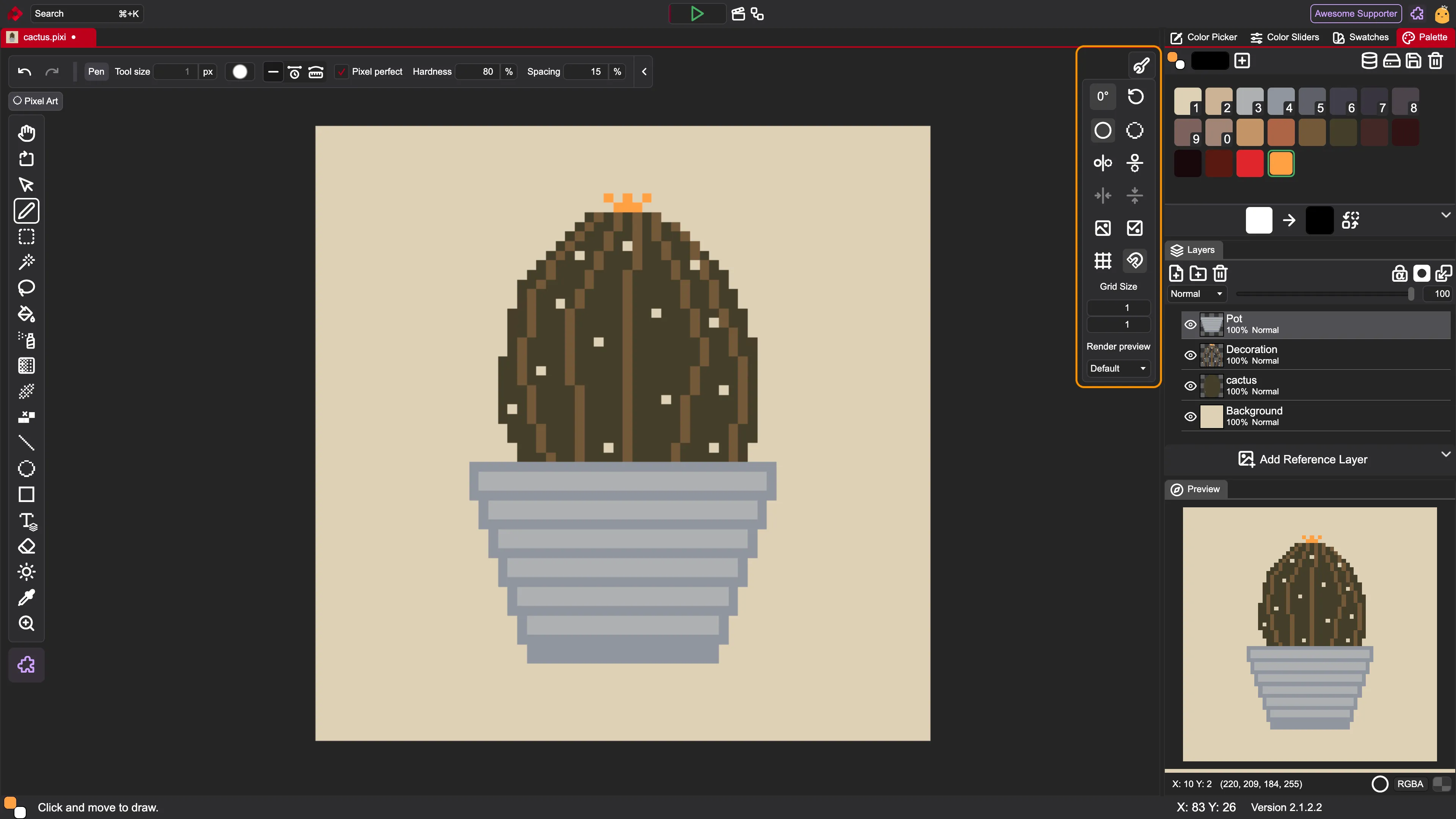
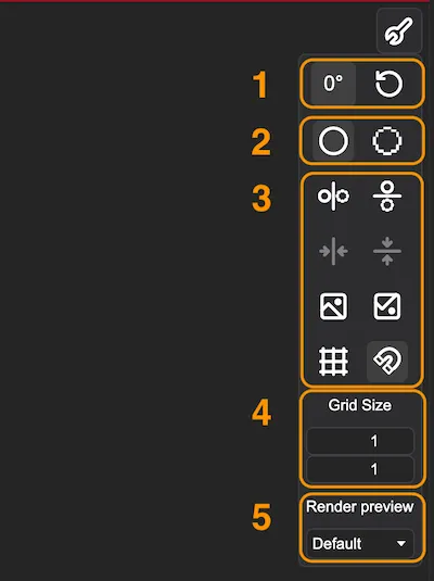
1. Canvas Rotation
Section titled “1. Canvas Rotation”- Number of degrees by which the viewport is rotated. To rotate the viewport, use the rotation tool available in each toolset.
- - Resets the viewport to the default rotation, position, and scaling
2. Canvas Resolution
Section titled “2. Canvas Resolution”A toggle to enable/disable the viewport’s high-resolution preview:
- - High resolution preview. Vector shapes, such as an ellipse drawn on a small 64×64 canvas, render smoothly without visible pixelation.
- - Document resolution preview. Vectors render to the document’s actual resolution, showing you the exact pixelated look the file will have once exported to a raster format.
3. Canvas Options
Section titled “3. Canvas Options”- - Turns on/off a symmetry line along the y-axis
- - Turns on / off a symmetry line along the x-axis
- - Centers the symmetry line along the y-axis
- - Resets the symmetry line along the x-axis to default position
- - Flips the viewport horizontally. It is only a preview option; it does not affect the layers. To transform the image, use the
Image → Flipmenu option. - - Flips the viewport vertically. It is only a preview option; it does not affect the layers. To transform the image, use the
Image → Flipmenu option. - - Turns on / off the gridlines
- - Turns on / off the snapping
4. Grid Size
Section titled “4. Grid Size”Gridlines provide a visual overlay of intersecting lines across the canvas to help you precisely align elements, measure proportions, and place pixels or vector shapes with accuracy.
You can use the dimension inputs to change the size of the gridlines. Type your desired values directly into the fields, or hover over an input and drag your mouse to find the ideal size interactively.
5. Render Preview
Section titled “5. Render Preview”This dropdown lets you choose between different previews of a file. Check Custom Workspaces docs for more info.
Top Bar
Section titled “Top Bar”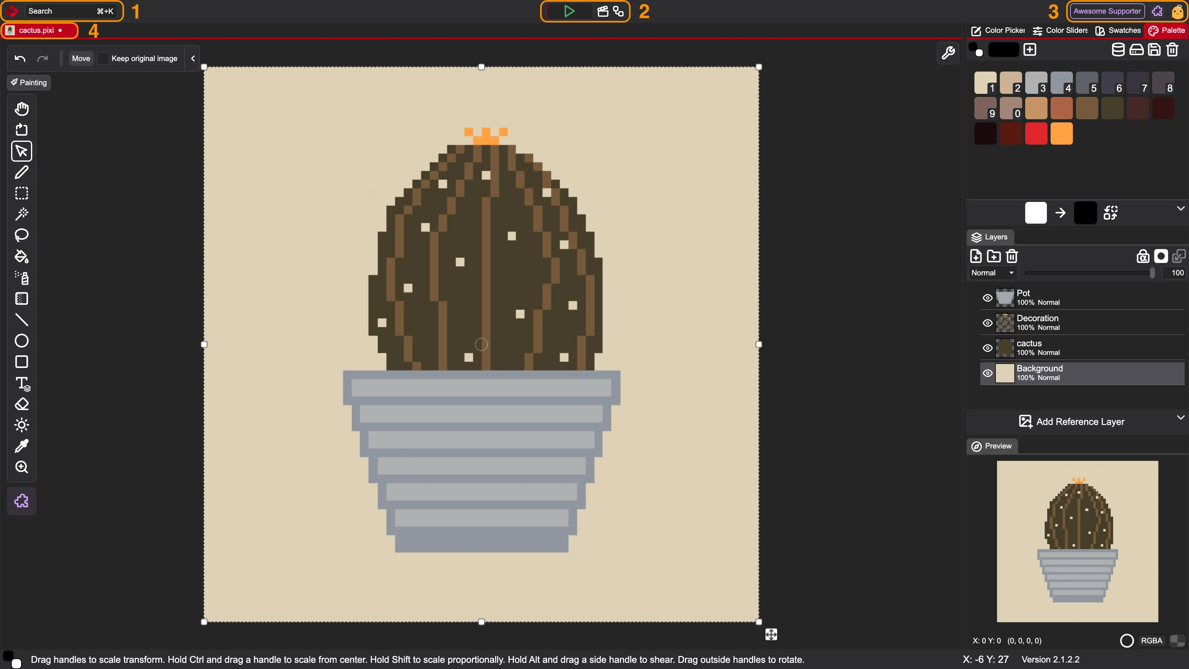
1. App Info + Search
Section titled “1. App Info + Search”On the left, there is a PixiEditor logo. Clicking on it shows the current version and lets you download an update if available - you will see a blue dot on the logo if that’s the case.
For Windows and Linux users, there is an app menu between the logo and a search bar.
The last element here is a search bar. You can click on it or use a shortcut: Ctrl + K / ⌘ + K.
It lets you search for files, but you can also look for actions like flipping, resizing, etc. It also shows a shortcut if available, so it is a good way to learn the app!
2. Quick Actions
Section titled “2. Quick Actions”- - Mini animation player. You can play/pause your animation by clicking on the green button and change the active animation frame with the red indicator underneath.
- - Opens an Animation Timeline. Content of the Timeline depends on the active file.
- - Opens a Node Graph. Content of the Node Graph depends on the active file.
3. Account Info
Section titled “3. Account Info”On the right side, you can see an account icon. By logging in, you can access and purchase extensions. Some extensions include UI decorations like the “Awesome Supporter” badge.
Next to the account icon, there is an extension icon that opens the Extension Library.
4. Opened Files
Section titled “4. Opened Files”Right below the top bar, you can see a list of opened files. The active file is highlighted in red. There is always a small preview and a name. If a file has unsaved changes, you will see a white dot next to the name.
Bottom Bar
Section titled “Bottom Bar”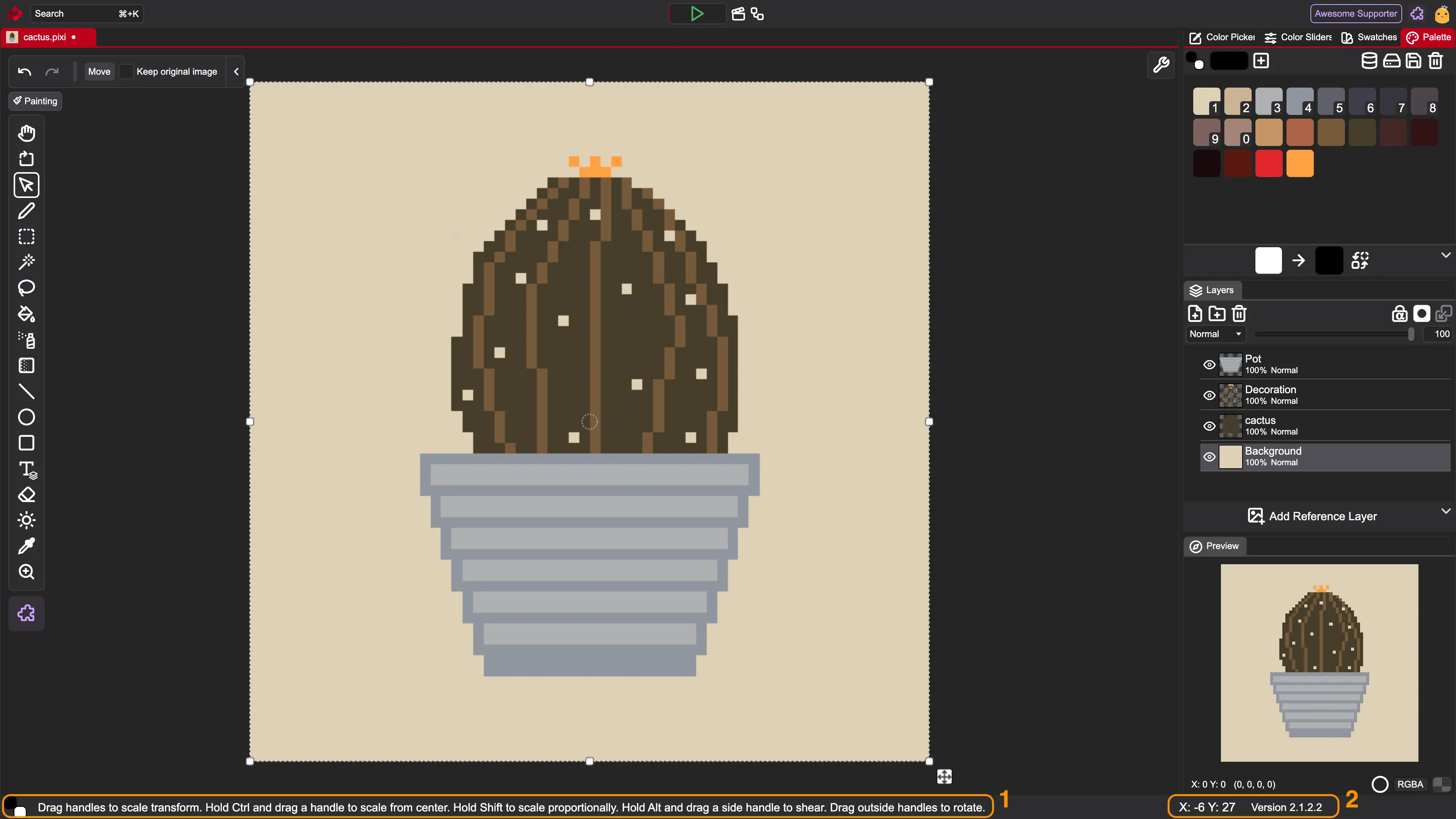
1. Color and Tool Info
Section titled “1. Color and Tool Info”- The two squares represent the current primary and secondary colors
- The text presents information about how to use the selected tool

2. Position and Version Info
Section titled “2. Position and Version Info”- The X and Y show your pointer position on the canvas. It is not limited to the size of the document.
- Next to it, there is the current version of the app.

All of our content is carefully written by hand, no AI was involved during the process.