PixiEditor 1.0 Released!
Hello pixel makers, finally, after years of development, PixiEditor 1.0 is released! Check out new exciting features, changes, and what's coming next.
This blog post will cover lots of things, I encourage you to read it all, but if you want, you can skip some parts using the navigation on the right.
Some history
PixiEditor came a long way since 2017, yes, 2017. It's hard to believe it's been six years. Of course, the first 3 years were pretty slow in development, it was just a fun, learning-focused side project. Right now, however, it's something bigger. During the first year, PixiEditor was hidden from the world, only my hard drive knew the depths of pixel-assembling software, called back then "Pixi".
It was bad, really bad, but without it, PixiEditor 1.0 would never happen.
The first public version of rebranded Pixi was released on October 10th of 2018, and since that day, it's been known as PixiEditor. In 2019, very little happened, only one little update was released. Mostly because I worked on other projects and PixiEditor was just one of many I started back then. But I've seen potential in it.
There are a lot of pixel-art-focused apps like Aseprite, Piskel, Pixel Studio, or Pixelorama, not to mention general-purpose raster graphics editors like Photoshop or Gimp, which can be configured to draw pixel art. The market seems crowded, doesn't it? Why would anyone need yet another app? The answer is...User interface and user experience.
Let's face it, the world is ruled by proprietary software. If you ask a random person if he knows what Photoshop is, most likely, he heard about it at least once in his life. What about GIMP then? Well, I wouldn't be so sure.
I noticed that a lot of open-source programs, even powerful ones, tend to expose their features to users in unpleasant ways, either visually or in terms of intuition. To back up my statement, here are some examples.
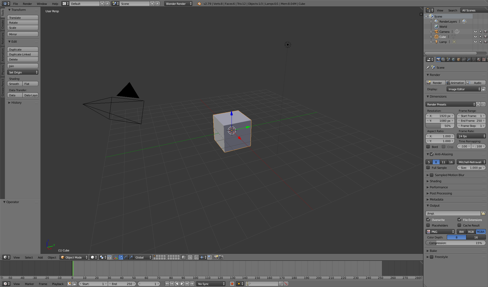
Blender
The extremely powerful and popular 3D app, before version 2.8, using it was a pain. Thankfully v2.8 solved that issue, but it's still a good example since open-source blender was released in 2002 and version 2.8 in 2019, so whooping 17 years of pretty bad UI and UX, confusing shortcuts, and navigation.

Inkscape
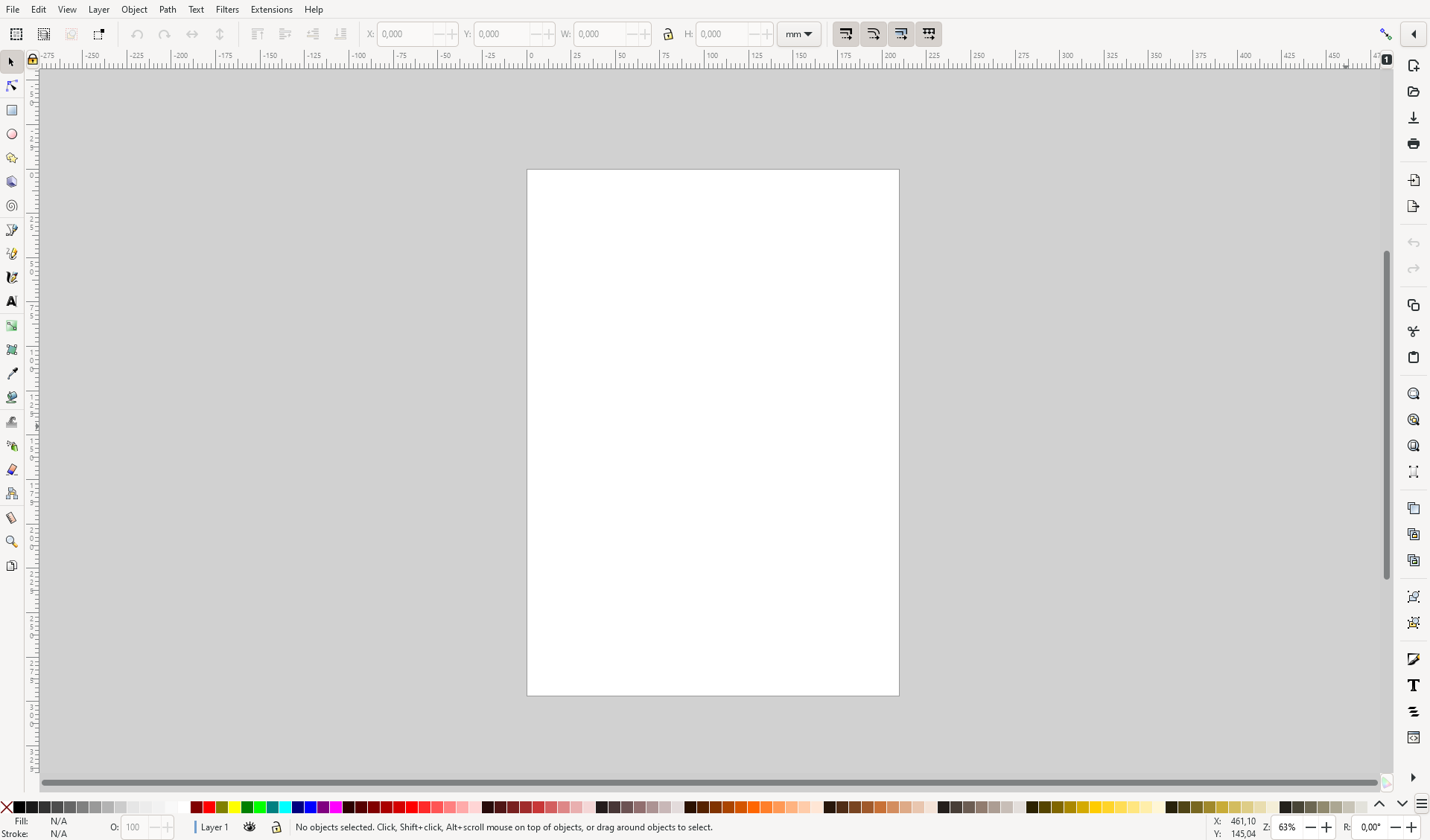
Now let's check out the most popular free and open-source vector graphics editor.

WHOAH, that's a lot of buttons, what do they do? I don't know, I just want to draw a simple line.
Ok, it is written here that this tool can create a straight line. Let's draw one then.
Uh oh, where is my line? Even dragging the box around requires surgical precision.
After 10 minutes of trying to find the answer in the official manual, online forums, and by clicking things in the app I finally found that you have to hold Shift and click on color to set stroke color.

Not very intuitive for a beginner, right? After even more time, I found the fill and stroke menu, which exposes all the options the way it should've in the first place. Why it doesn't show automatically? Why top bar doesn't have a button to toggle it?
I don't know.
All of the mentioned programs are fantastic and used by many users and I totally get why, some of them are my apps of choice too. But I think, that the world needs free alternatives to paid programs, which look good, feel good, and most importantly, are easy to use. And that's our goal.
All great, but what about pixel-art-focused programs that are already on the market?
Well, one true king at the moment, is Aseprite. Which is paid. Their pixelated UI style doesn't click for me, but it's a rather subjective matter. The thing is, people who are used to Photoshop, probably need to learn Aseprite UI and shortcuts for a while, since the layout is a bit different.
We tried solving this by mimicking Photoshop's layout, people are used to it, and finding stuff should be easy. Of course, PixiEditor has its own distinctive style, features, and QoL elements.
But let's check what's really inside PixiEditor 1.0.
What's new
We've listed some of the new stuff in previous devlog, however, I'll describe them here too.
Palette system with Lospec integration
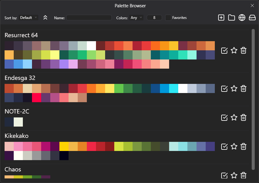
Dedicated system for managing color palettes, which allows to easily access to colors with shortcuts 1,2,3 etc. The system consists of a palette browser which is like a database for your palettes, you can quickly access them, mark them as favorites, delete, rename them, etc.

One of the most interesting things it has is the Lospec Palette List integration. What does it mean?
Lospec is the most popular pixel-art site with a great palette database, PixiEditor 1.0 supports their palette protocol, which allows importing palettes from their website with just one click.
Symmetry
Achieving geometrical perfection takes time. But those 2 funky lines can help you with that.
It's like having 4 hands drawing simultaneously.
New selection transformation
Selection now allows scaling, rotating, skewing and transforming perspective (with pivot!).
Lasso tool
Command Search and editable shortcuts
The whole codebase in PixiEditor 1.0 was rewritten from the ground up. And thanks to that, we've built quite a robust command system, which allows you to easily search for stuff and rebind shortcuts.
Not only you can use it to find actions, but also to parse colors!
Layer Masks
Layer masks are a great way to hide parts of a layer. And we have them now! Below is a video example of how it works.
Clip layers
Layers are now clipable, which means you can use one layer as a mask for the other. Let's say you have a layer with a weapon, and you want to draw on top of it some patterns. Instead of drawing on the same layer, you can now create a new layer, clip it to the weapon layer, and without a lot of precision, draw on top of it.
Lock layer alpha
It's like a clip to other layers, but it allows clipping to itself. In other words, if you toggle lock alpha, you won't be able to draw on transparent pixels on this layer.
Blend modes
Blend modes define how colors from different layers mix together. PixiEditor 1.0 allows you to change the blend mode of each layer. Simple as that.
Other stuff
There are way more things that I didn't mention, but listing all of them would take way too much space and time. You can check detailed changelog here or ultra-detailed changelog here
What's next?
PixiEditor doesn't end on 1.0, we have a lot of plans for the future. Hopefully, they see the light of day. Here is a brief list of things that we want to implement.
V1.1�
For 1.1 we want to add localization support starting with 4 languages out of the box (English, Polish, German, and Russian) and launch community translations for more.
V2
For 2.0 we plan to port PixiEditor to the new framework, AvaloniaUI, which will allow us to run PixiEditor on platforms like Linux, macOS, and maybe the web. This is an ambitious goal because it means we have to rebuild the whole UI from the scratch, but it's worth the effort.
We don't have concrete plans for other features yet, but there will be something for sure! We thought about tile drawing, custom brushes, FX, but we're not yet sure. Feel free to join us on Discord and talk about it with us!
V3
Version 3.0 is exciting because it'll bring animation creation tools. It's one of the most requested feature by our community and we want to do it well.
It's a far future, but we can't wait to show it to the world.
Steam release
We are widening our distribution line, along with Microsoft Store, itch.io, and our website, we've launched PixiEditor on Steam! Of course for free. You can now easily track hours spent in PixiEditor.
Tutorials
We are working on creating tutorials on how to use PixiEditor, check out our YouTube Channel for more info!
Contributors
I'm extremely grateful to all people who made PixiEditor 1.0 possible. Huge shoutout to Equbuxu, who was responsible for the whole rework of architecture, without him, this release wouldn't be as big as it is.
Of course, as always, huge thanks to PixiCPU for bringing a lot of great features.
To all dev-testers, artists, and external contributors, Thank you. Your support is invaluable and you are awesome.
Go draw some pixel art!
The only thing that was left to say is, good luck and have fun drawing!
We hope you'll like it, if you do, please consider a donation, we are an open-source an organization that makes all of this for free, your support can help us grow and make even more great stuff faster. Perhaps one day, we'll be able to work full-time on PixiEditor. Also, we'd be grateful if you left a review on Steam or Microsoft Store, it means a lot to us and we hear your feedback.

Changelog
- PixiEditor is now on Steam!

Additions:
- Complete rewrite of PixiEditor's architecture
- Performance improvements for large canvases

	Commands, shortcuts:
- Added command search, a handy window that lets you search for any action you want to make in PixiEditor. You can access it using the searchbar on top or by pressing Ctrl+K.
- You can set your own shortcuts now. If you are used to the ones from Aseprite, you can load the aseprite shortcut template without changing them manually.

	Selection:
- Improved the performance of all selection tools
- Added a way to transform the selected area in different ways (move, rotate, stretch, shear, perspective)
- You can now move and rotate shapes before applying them
- Added a lasso tool
- You can't draw outside selection now
- You can now invert selection

	Layer Manager:
- Added a slider for layer opacity
- Added layer blend modes
- Added lock alpha, a feature that prevents you from drawing on the transparent portions of the layer.
- Added layer masks
- Added clipping to layer below
- Groups are now called folders and they can now be empty

	Palettes:
- Added a palette system. You can now import palettes from lospec, save and load them from files. The palette browser has all the palettes you have in PixiEditor.
- You can use the replace color feature of the palette to replace some color with another on the whole canvas

	Reference layer:
- The reference layer is now saved in .pixi along with the rest of the drawing
- You can now move the reference layer around, rotate it, and put it above or below your drawing

	Other:
- Added symmetry, a feature that automatically mirrors everything you draw to the other side of the canvas
- Added percentage scaling to the export menu, along with a hint saying what percentage might be the best.
- Added a thing that shows the currently selected color in the bottom left corner
- You can now rotate and mirror the viewport (in a way that doesn't affect your drawing, it only affects how you see it in PixiEditor)
- Added a wrench button in the top right corner which contains some useful viewport settings
- You can now open the same file in multiple windows, and the windows will update in real time
- The default transparent checkboard background is now less trippy
- Added an About window with all the info about the project
- The shape of the brush is now shown as a contour
- Added ways to rotate and flip the canvas
- Floodfill now takes all layers into account if you hold down Ctrl
- Moved the "Copy Main Color" button into the color picker window. The button is used to set the fill color of a shape to be the same as the currently selected color.
- Updated Discord rich presense preview to the new design of Discord in settings
- The color picker tool can now pick colors from just the current layer, without taking the ones underneath into account.

Fixes:
- The mouse pointer no longer lags when launching PixiEditor
- If you had many layers and tried deleting or creating one, PixiEditor used to lag. This is now fixed.
- Fix crash when saving a file with a filename ending in .mod
- PixiEditor should no longer completely stop responsing during long operations, instead it should show a loading animation